2027 Home Paint Colors: The Return of Warmth, Depth, and Personality
Home Design and Decor Velinda Hittinger October 17, 2026
Home Design and Decor Velinda Hittinger October 17, 2026
A fresh coat of paint can do more than change the color of a wall. It can transform the atmosphere of a room, highlight a home's character, and make everyday spaces feel more personal. As we look toward 2027, homeowners have an exciting range of colors to consider, from rich, earthy browns and dramatic reds to calming blues, nature-inspired greens, and cheerful golden tones.
Rather than relying solely on traditional neutrals, today's color conversation invites us to explore shades with more depth, warmth, and individuality. Whether you're preparing your home for the market, planning a renovation, or simply ready for a change, the right color can help you create a space that feels welcoming and distinctly yours.
The appeal of these colors isn't limited to one decorating style. Some work beautifully in traditional homes, while others bring a fresh perspective to contemporary spaces. The key is understanding how a color interacts with natural light, existing finishes, and the overall feeling you want your home to convey.
Let's explore seven colors worth considering as you imagine new possibilities for your home.
1. French Press Coffee — Dunn-Edwards DEBN07
Sometimes, a neutral color doesn't have to be light to feel versatile. French Press Coffee offers a deeper alternative to familiar beige and gray, bringing a rich brown tone with subtle complexity. Selected by Dunn-Edwards as its 2027 Color of the Year, this shade demonstrates how a darker color can create warmth while giving a room a distinctive personality.
Imagine this color on kitchen cabinetry, an accent wall, or the interior of a comfortable study. It could also make a memorable impression on a front door, where a deep, sophisticated shade can complement lighter exterior finishes. For homeowners who appreciate a layered, collected look, French Press Coffee offers an opportunity to introduce depth without relying on stark black.
Pairing this shade with cream-colored walls, natural wood, linen fabrics, or warm metal finishes can help balance its richness. In a room with limited natural light, consider using it on a smaller feature rather than covering every wall. In a brighter space, it may provide a beautiful contrast against lighter furnishings.
For inspiration, visit the official Dunn-Edwards French Press Coffee color page
Décor Idea: Clay‑Tone Reverie | 3D Textured Wall Art – Pure Oil Studio
2. Artifact — Pittsburgh Paints PPG10-16
Blue has long been a favorite for homeowners seeking a calm, familiar color, but Artifact offers a softer, more nuanced approach. Pittsburgh Paints selected this smoky blue as its 2027 Color of the Year, highlighting a color that feels grounded without appearing overly bright or formal.
Artifact could be an appealing option for a bedroom, home office, or living room where you want a restful atmosphere. Its muted appearance also makes it worth considering for cabinetry or a feature wall, especially when paired with warm wood and understated furnishings. Rather than competing with the rest of the room, a smoky blue can provide a backdrop for artwork, decorative objects, and personal touches.
This shade may be especially appealing to homeowners who enjoy color but aren't ready for something particularly bold. It offers more personality than a basic off-white while remaining relatively easy to incorporate into a variety of decorating styles.
Consider pairing Artifact with creamy whites, natural textures, or carefully chosen green accents. If your room receives cooler northern light, test a sample first to see how the blue appears throughout the day. The same paint can look noticeably different depending on the room's lighting and surrounding materials.
Explore Artifact: 2027 Color of The Year
Décor Idea: Kalaty Rug Co. Bespoke Pillow PB-574 Abstract Blue / Grey Pillow – Rugs Done Right
3. Bewitched — Benjamin Moore CSP-450
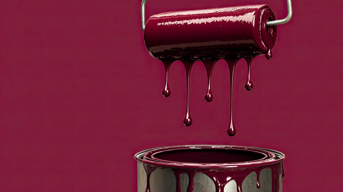
For homeowners who want to move beyond traditional neutrals, Bewitched offers a dramatic alternative. This deep oxblood red from Benjamin Moore has the richness of burgundy, with enough depth to create a striking backdrop for carefully selected furnishings and finishes.
Although Bewitched is not Benjamin Moore's official 2027 Color of the Year, it is an interesting shade to consider for anyone drawn to deeper, more expressive colors. Its bold character makes it particularly suited to spaces where a little drama can feel intentional, such as a dining room, powder room, or intimate reading nook.
If painting an entire room in a deep red feels like too much of a commitment, start smaller. A single wall, a built-in bookcase, or a painted furniture piece can introduce the color without overwhelming the space. Warm wood, soft neutral fabrics, and thoughtful lighting can help create a balanced result.
Deep colors can also emphasize architectural details, making them worth considering in rooms with interesting trim, built-ins, or distinctive features. However, they may make a small or poorly lit room feel more enclosed, so testing a sample is particularly important.
Bewitched is a reminder that a home doesn't have to follow every trend to feel current. Sometimes, choosing a color that reflects your own taste creates a more meaningful result than selecting the safest option.
See the shade on Benjamin Moore's official Bewitched color page.
Décor Idea: Terracotta and Rose Wall Art | Oversized Gold Leaf Canvas – Sense for Decor
4. Deep Rooted — Dutch Boy Paints 311-7DB
Warm colors can make a room feel inviting, and Deep Rooted brings that quality through its earthy orange tone. Named Dutch Boy Paints' 2027 Color of the Year, this shade draws inspiration from natural colors and offers an alternative to the cooler palettes that have dominated many interiors.
Deep Rooted could be an appealing choice for a living room, creative space, or dining area where you want a sense of energy and warmth. It can also make a strong statement on a front door or a carefully chosen accent wall. For homeowners who enjoy color but prefer shades influenced by nature, this earthy orange may be worth exploring.
The secret to using a stronger color is giving it room to shine. Creamy whites, warm wood finishes, and restrained decorative accents can help balance the richness of Deep Rooted. For a more adventurous look, muted blues and greens may provide an interesting contrast.
Before committing to a large area, consider how the shade works with your flooring, furniture, and existing finishes. An orange that looks welcoming on a small paint chip may appear much more intense when applied across an entire wall.
Used thoughtfully, Deep Rooted can bring personality to a home while creating a warm backdrop for everyday living and entertaining.
Discover more through: 2027 Color of the Year - Deep Rooted 311-7DB | Dutch Boy
5. Pale Amaranth — Jax & Hue
Not every color needs to make a bold statement. Pale Amaranth offers a softer alternative for homeowners who appreciate subtle color and a quieter atmosphere. This delicate lavender shade has a muted quality that can bring a gentle touch of color to a room without feeling overly sweet or bright.
Consider Pale Amaranth for a bedroom, reading area, or creative space where you want a softer visual effect. It could also be an unexpected choice for a small sitting room, particularly when paired with simple furnishings and natural textures.
Creamy white trim, pale wood, and understated fabrics can help the color feel balanced. For a more contemporary look, consider combining it with clean lines and restrained accessories. If you prefer a more traditional style, soft upholstery and warm wood furniture may complement its gentle character.
Lavender can be particularly sensitive to lighting. Depending on the direction a room faces and the type of light it receives, Pale Amaranth may appear cooler, warmer, or more noticeably purple. This makes testing a sample in the intended space especially worthwhile.
For homeowners who want to introduce something different without choosing a dark or highly saturated shade, Pale Amaranth provides another way to move beyond plain neutrals. It is also a reminder that personality can come from subtle choices just as easily as dramatic ones.
View the color and sample options: Pale Amaranth Paint | Muted Lavender | Jax & Hue
Décor Idea: Forand Faded Oriental Medallion High-Low Plush Area Rug | Wayfair
6. Webster Green — Benjamin Moore HC-130
Green continues to offer a natural connection between interior spaces and the outdoors. Webster Green, Benjamin Moore's official 2027 Color of the Year, brings a deep, classic green that can work across traditional, contemporary, and transitional homes.
This shade could be especially effective in a study, living room, or kitchen where you want a color with a strong presence. It may also be a beautiful option for cabinetry, a built-in bookcase, or a front door. In the right setting, a deep green can feel both established and fresh, giving a room character without relying on a particularly bright color.
Webster Green pairs naturally with lighter neutrals, wood finishes, and thoughtfully chosen natural materials. Creamy whites can create contrast, while wood tones can help the space feel warm and connected. If you're considering green cabinetry, look at how it works alongside your countertops, backsplash, and flooring before making a final decision.
For homeowners who enjoy classic design, green offers another advantage: it can complement a wide range of furnishings and decorative styles. You don't have to redecorate an entire room to make the color work. Sometimes, a painted feature or a single architectural detail is enough to change the feeling of a space.
Explore: Webster Green on Benjamin Moore's official website
Décor Idea: Green Mist Glass Bowl | Z Gallerie
7. Trinket — Sherwin-Williams SW6685
After exploring several deep and earthy colors, let's finish with a brighter option. Trinket is a yellow paint color from Sherwin-Williams that offers homeowners an opportunity to introduce a cheerful note into their spaces.
Yellow can be an appealing choice for areas where you want a brighter, more energetic atmosphere. Depending on the room and the surrounding finishes, Trinket could be considered for an accent wall, a small entryway, a creative workspace, or a painted furniture piece. It may also appeal to homeowners looking for a distinctive color in a breakfast nook or another casual gathering area.
Because yellow can be visually strong, placement matters. Using it in a smaller area or balancing it with quieter colors can help prevent the space from feeling overwhelming. White trim and simple furnishings may provide a clean contrast, while natural wood can make the overall look feel warmer.
Lighting is important here, too. Some yellows appear much brighter in direct sunlight, while others change noticeably under artificial lighting. Test the color on the wall before deciding how much of it to use.
Trinket isn't being presented as Sherwin-Williams' official 2027 Color of the Year. Instead, it rounds out this selection by showing how a brighter color can provide a different design direction from the darker, more muted shades featured throughout the article.
See the color on: Sherwin-Williams' official Trinket page
Décor Idea: Carolyn Kinder Aurora 9 Inch Vase-Urn | Capitol Lighting
Choosing the Right Color for Your Home
Before choosing a paint color, take a moment to consider the room itself. Natural light, ceiling height, flooring, countertops, and existing furniture all influence how a shade will look once it covers a wall. A color that looks beautiful in a photograph may appear quite different in your own home.
Start by narrowing your choices to a few favorites, then test samples in the rooms where you plan to use them. Observe each color in the morning, afternoon, and evening. If possible, look at larger sample areas rather than relying only on a small paint chip.
Think about the atmosphere you want to create, too. Do you want a bedroom that feels restful, a kitchen that feels warm and welcoming, or a dining room with a little more drama? Let the room's purpose guide your decision.
If you're preparing to sell, consider how your paint choices work with the home's overall presentation. You don't necessarily have to paint everything white or beige, but a cohesive palette can help rooms feel connected and allow buyers to focus on the home's features. Bold colors can still have a place when they're used thoughtfully.
Ultimately, the best color is one that works with your home, your lifestyle, and your plans for the space.
Final Thoughts
Paint is one of the many ways homeowners can express their personal style and bring new life to familiar spaces. Whether you're drawn to the richness of French Press Coffee, the calm of Artifact, the depth of Bewitched, or the natural appeal of Webster Green, the possibilities extend well beyond traditional neutrals. The right choice depends on your home, your preferences, and how you want each room to feel.
If you're thinking about buying or selling a home in Tallahassee, thoughtful presentation can be an important part of the process. I'm Velinda Hittinger, Broker Associate. I can help you navigate the local real-estate market and consider the features that matter most to you.
Connect with me and explore your next steps in Tallahassee real estate.
Home Design and Decor

Home Entertaining
About Tallahassee

Tallahassee Local Events


About Tallahassee

Home Design and Decor
About Tallahassee

Experience the difference that exceptional service and results can make in your real estate journey. Vellinda Hittinger is dedicated to providing personalized attention and expert guidance to each client, ensuring that your unique needs are met with the highest standards of professionalism.